
Smart, down-to-earth people
MyRepublic
Challenge
Singapore has a crowded telco category – big major players that dominate with high media spend and big event sponsorship but suffer from confusing packages and frustrating customer service. Conversely, there are many smaller brands that are positioned to appeal to millennials with coolness and convenience. MyRepublic sits in neither camp. It is a small, dedicated team of proud nerds who believe connectivity should be simple. They’re on a mission to create a better place. They’re also known for consistently high speed and routinely sweep awards every year for it.
Singapore has a crowded telco category – big major players that dominate with high media spend and big event sponsorship but suffer from confusing packages and frustrating customer service. Conversely, there are many smaller brands that are positioned to appeal to millennials with coolness and convenience. MyRepublic sits in neither camp. It is a small, dedicated team of proud nerds who believe connectivity should be simple. They’re on a mission to create a better place. They’re also known for consistently high speed and routinely sweep awards every year for it.
Solution
Rather than relying on traditional brand models or process diagrams, the strategy was built upon common sense and instincts.
Rather than relying on traditional brand models or process diagrams, the strategy was built upon common sense and instincts.
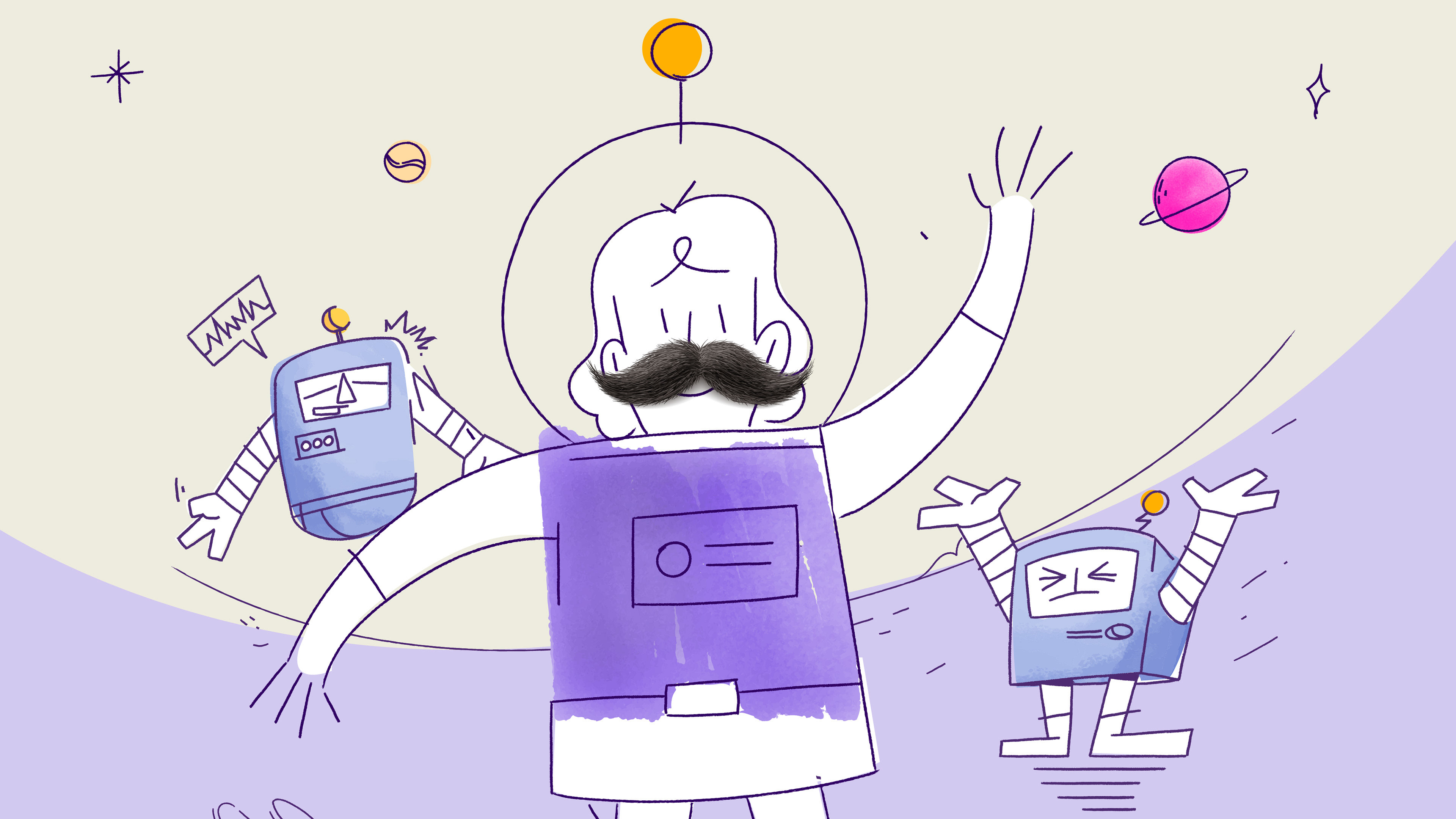
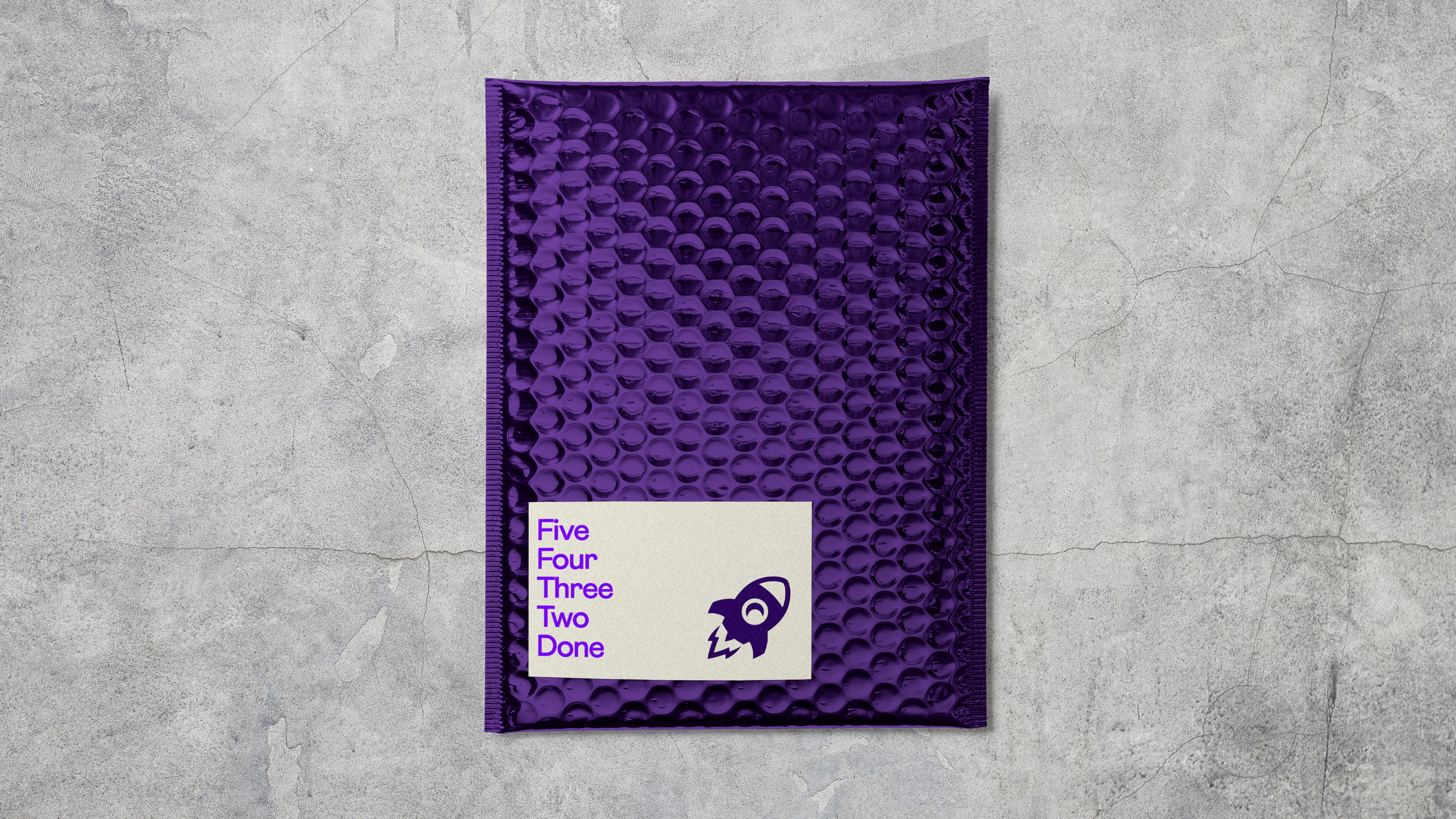
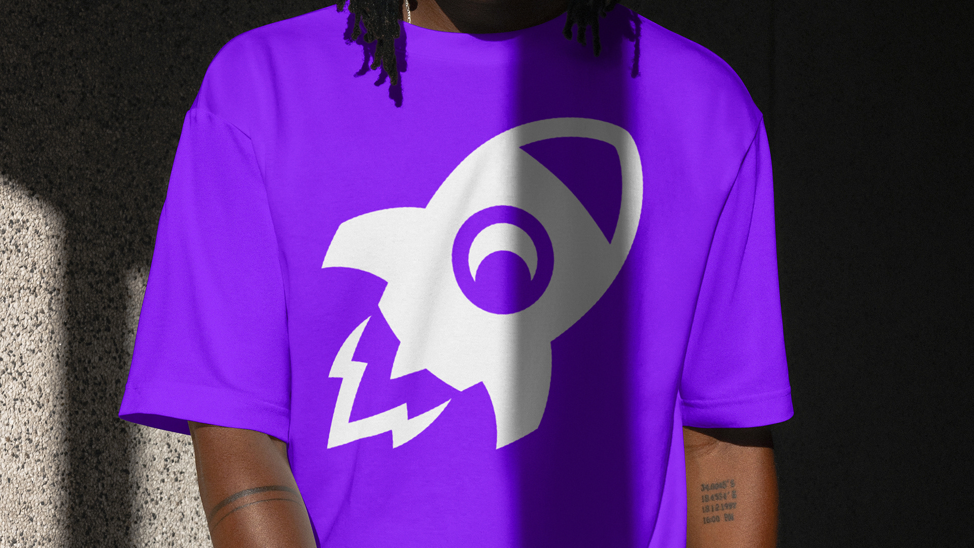
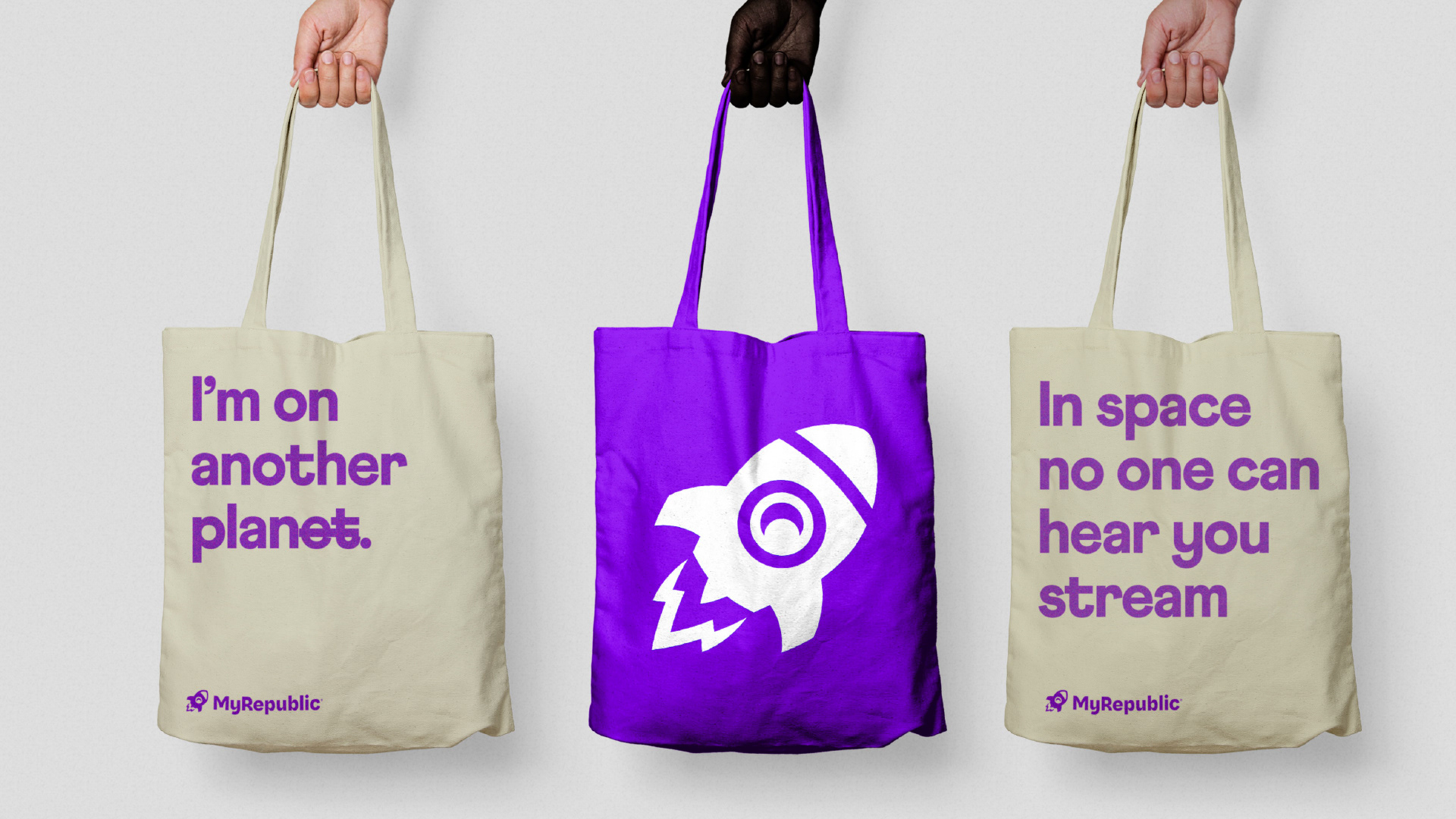
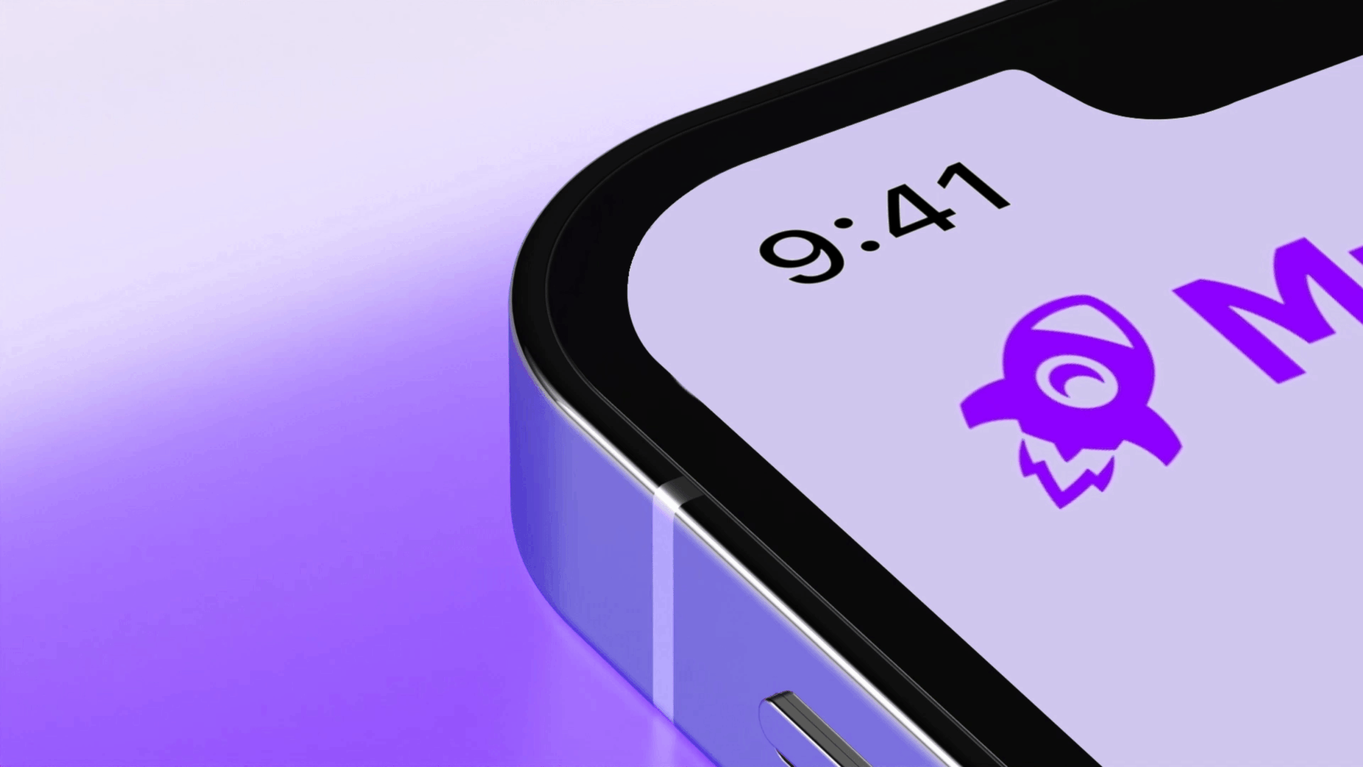
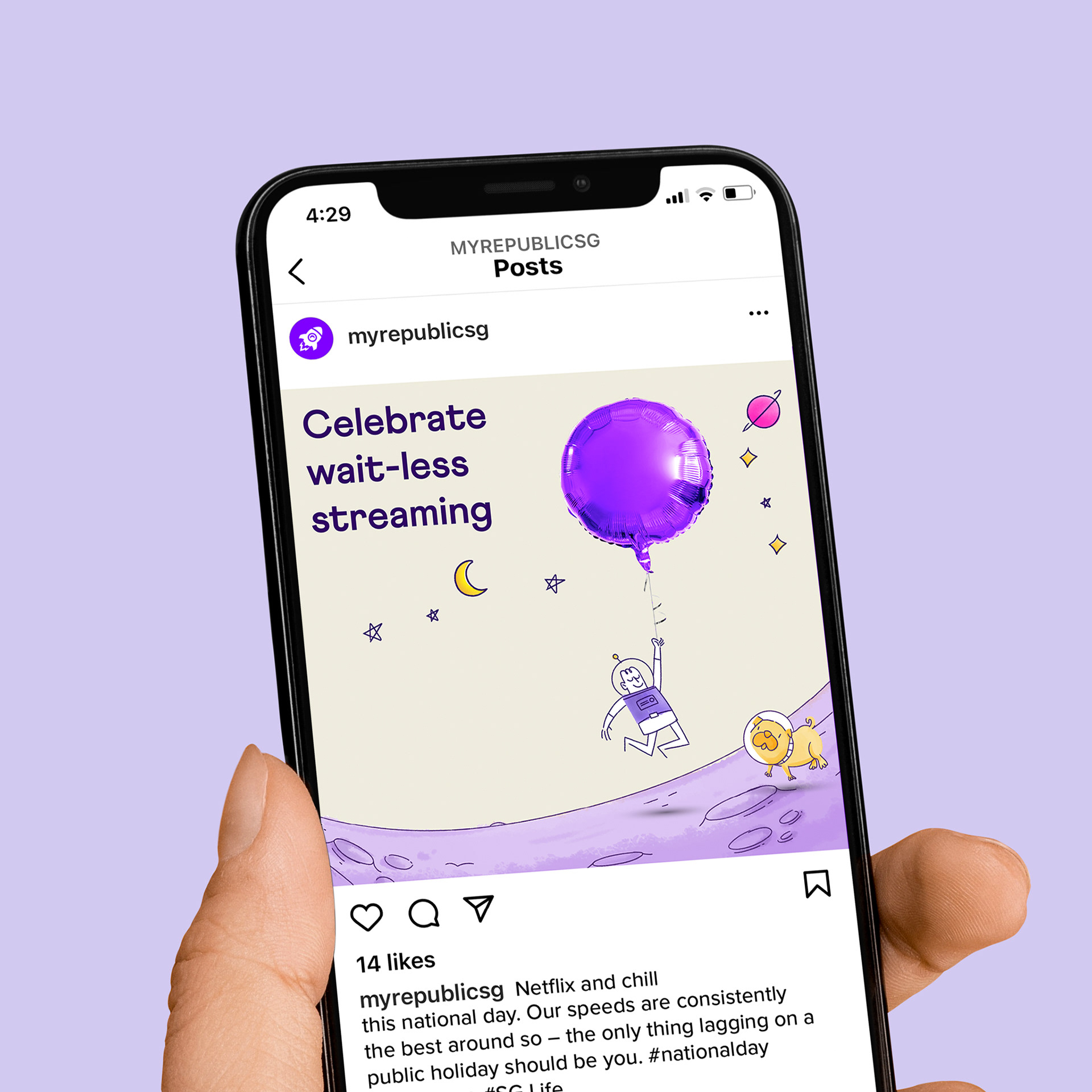
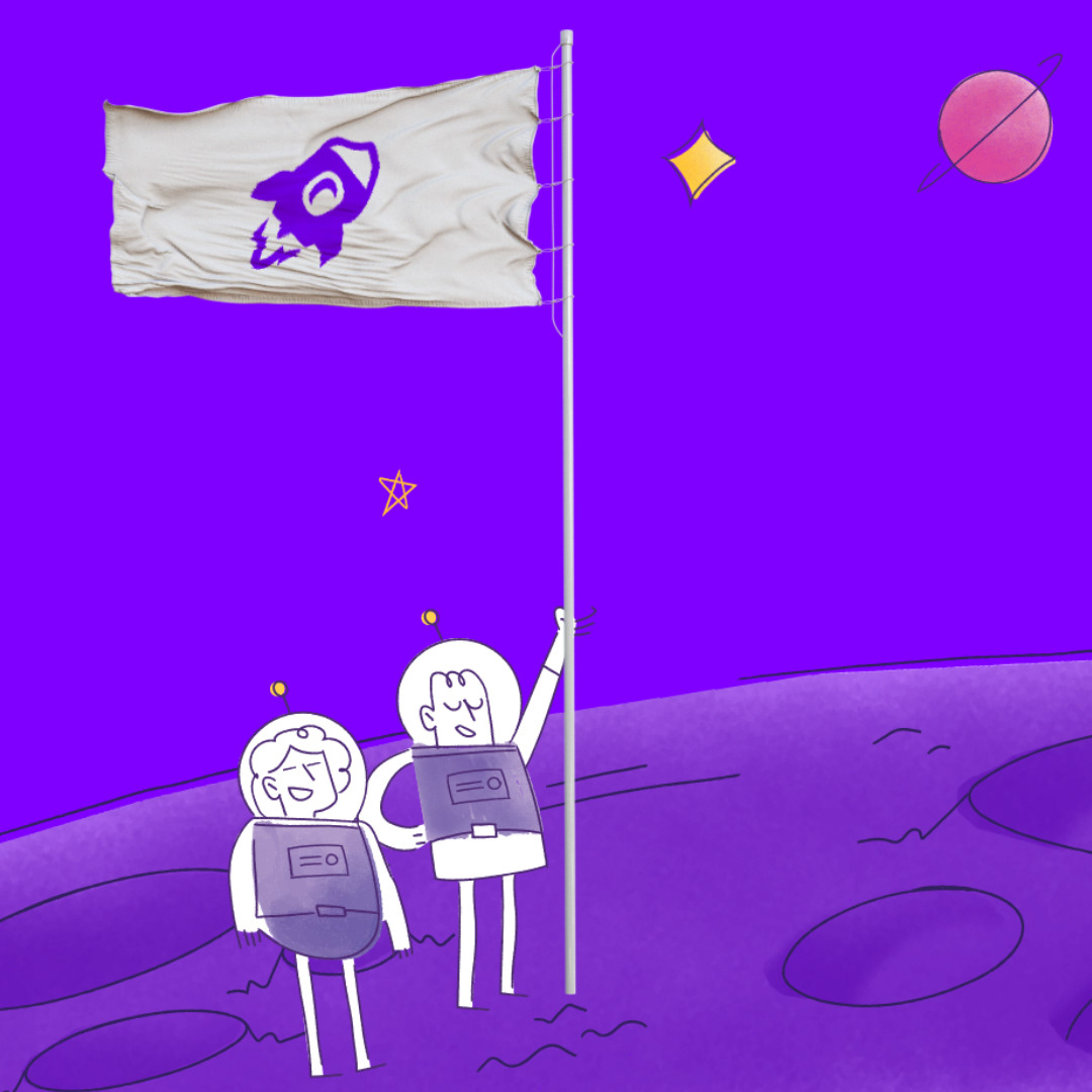
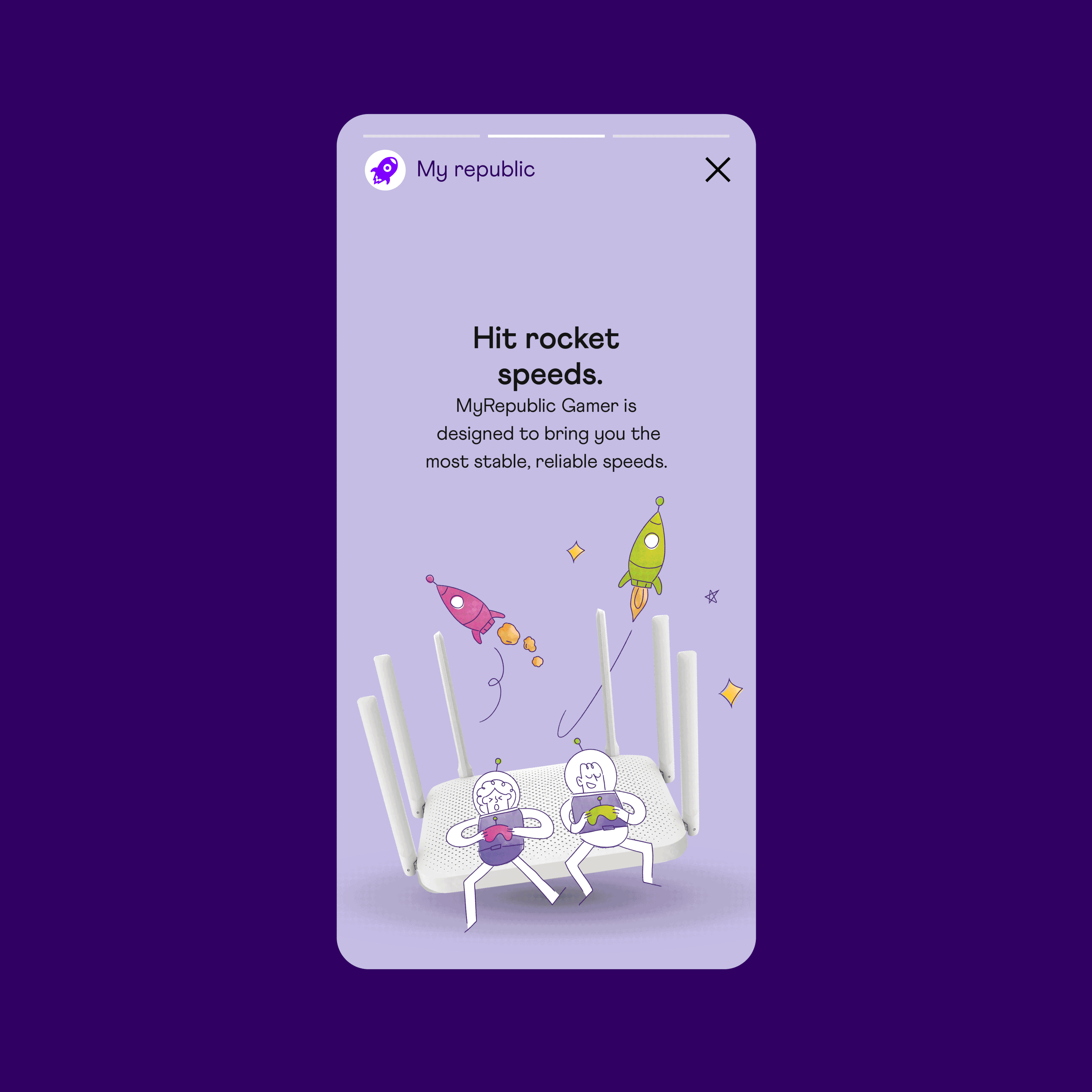
The existing rocket ship logo was a launchpad for an entire galaxy of quirky scenarios that customers could understand quickly and identify with. The visual system uses a library of quirky illustrations together with low-budget stock photography. Our tone of voice helped deliver our brand personality: Smart, down-to-earth people.
Results
We talked to existing MyRepublic customers...
• 96% agreed they preferred our new brand look, feel, and colours.
• 95% agreed that our new look conveys simplicity.
• 93% agreed our new look sets MyRepublic apart from other service providers.
• 90% agreed they relate to our new crew.
We talked to existing MyRepublic customers...
• 96% agreed they preferred our new brand look, feel, and colours.
• 95% agreed that our new look conveys simplicity.
• 93% agreed our new look sets MyRepublic apart from other service providers.
• 90% agreed they relate to our new crew.
Recognition
Transform Asia: Gold x2, Silver.
Transform Asia: Gold x2, Silver.
Creative Director. Superunion. Singapore, New Zealand & Australia.


'People who get people'. The strategic platform grounds us in how MyRepublic knows what it’s like to be the little guy and that’s their strength. Keeping it real, doing what’s right, and aiming for the stars.
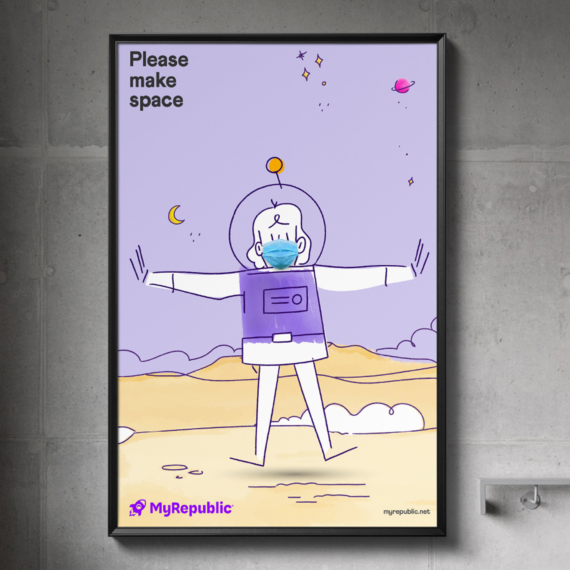
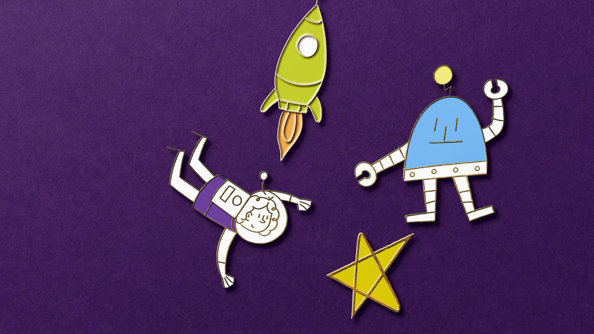
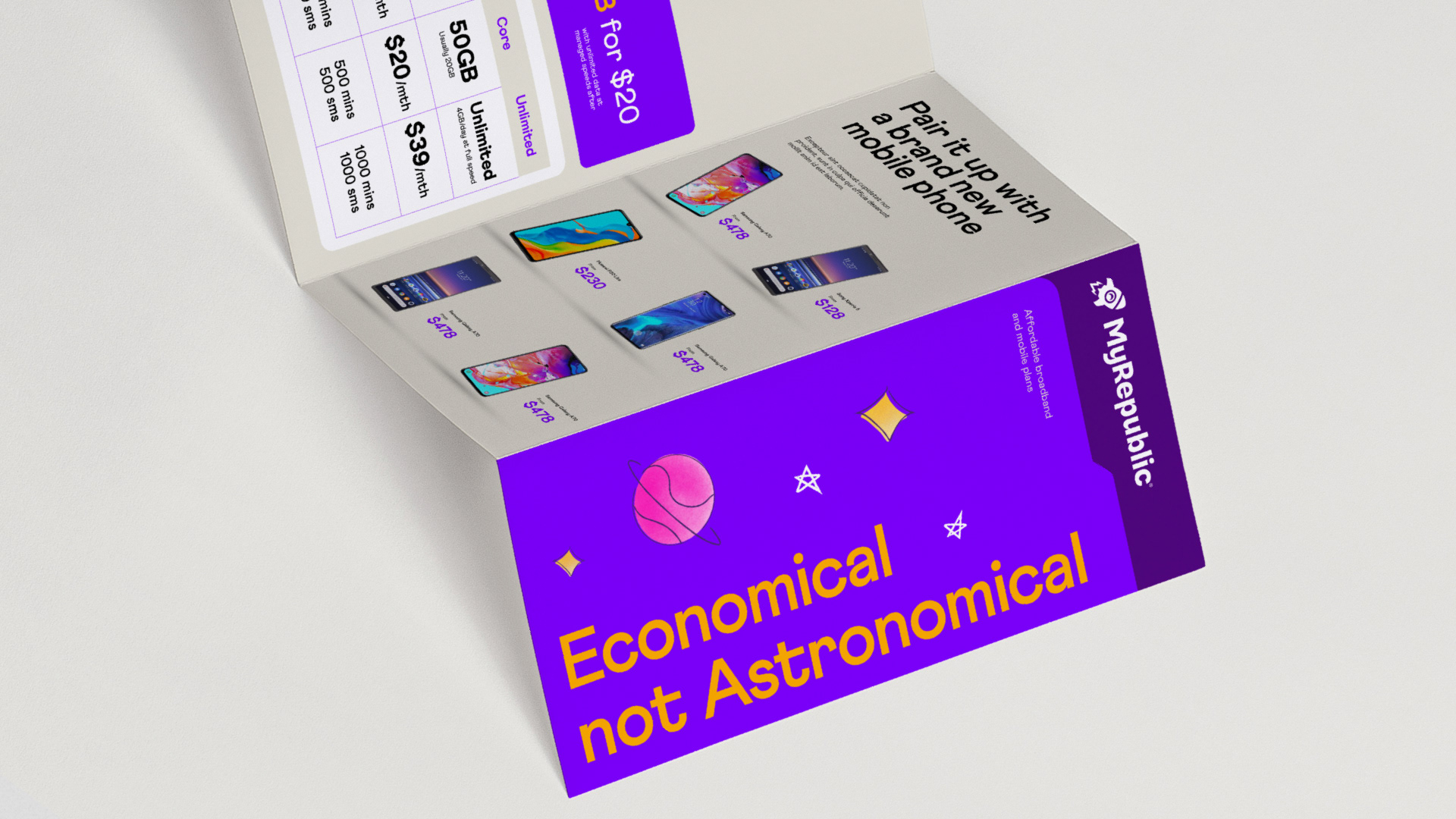
The visual system uses a library of quirky illustrations together with low-budget stock photography. Our tone of voice helped deliver the personality of smart, down-to-earth people.

Case Film